
In March 2018, Google announced that they are going to roll out Mobile first indexing. The discussion came after 2 years of detailed research from this search engine guru. As per the details, this roll out will prioritize mobile-friendly websites over other websites and may mark as a huge setback for the not-so-mobile-friendly websites.
This step from Google is a result of an increasing number of mobile users than desktop users. Prior to Google’s Indexing, Crawling and Ranking systems were considering the desktop versions of the websites only and this was affecting the mobile search results in a big way. This was because desktop versions had a huge difference from the Mobile versions plus they were not user-friendly. So Google has decided to roll out Mobile First Indexing for the ease of mobile users.
Every change has its pros and cons and so does this one. The announcement has brought up a lot of confusion mostly among webmasters and web business owners. They have come up with a lot of questions like – Will they have to mark any changes in their existing websites? If yes, then what type of changes will they have to make? Will the ranking lists also change along with the Index list? Will desktop friendly sites be affected?
We are going to discuss all of these in detail. This article will cover everything you need to know about Mobile First Indexing. We will discuss what Mobile First Indexing is and how does it work exactly. Also, we will look at its consequences on the existing websites.
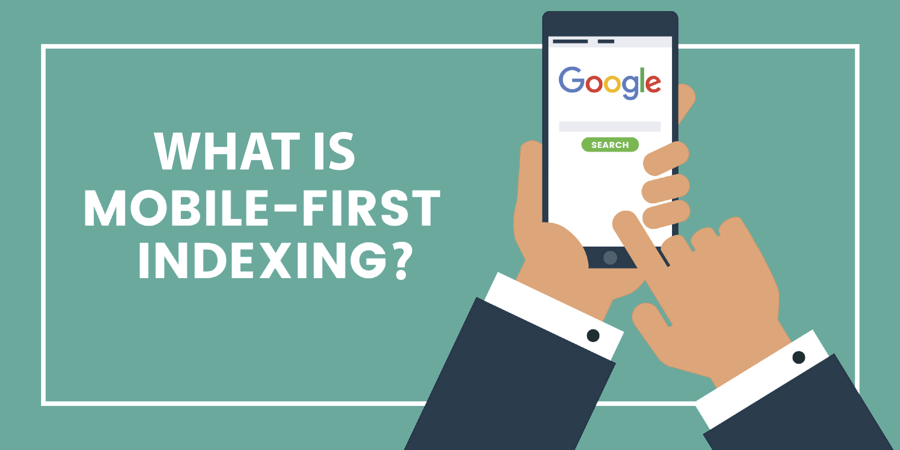
What is Mobile First Indexing?
Well, we will have to start from the basics first. Before knowing on how exactly Mobile-First Indexing works, let’s know what Mobile First Indexing actually is and why it has brought such a huge uproar in the digital market. Eventually, we we will also get to know on why Google think of rolling it out at the first place.
Mobile-First Indexing, as the name suggests, is a program for indexing the Mobile friendly sites with high priority. These websites will appear first in the Google search results. This means that Google will first include the Mobile versions of your websites in their index rather than desktop version.
If you let a crawlbot monitor the traffic in your website you will find that there is an increase of Smartphone Googlebot traffic in your website and you will find that the cached version of the pages will be the mobile version of the page.
According to Google:-
Mobile First Indexing is starting in a very broad way now and being indexed in this manner won’t change the rankings of the sites.
Process for Google on Mobile First Indexing:-
What will be the profit?
Needless to say, the attempt has been made keeping an eye on the increasing number of mobile users than desktop users. Gone are the days when people used to sit in front of a big PCs to surf necessary information from the internet. Now, this new digital era has improved on that. Mobile devices are getting more preferred over desktops. Thus, it is natural for the Google to optimize its search algorithm accordingly. Introducing Google Mobile First Indexing will solve that issue for sure. Mobile friendly websites will be sorted and will be ranked high. It will tempt other desktop site owners to transform their websites into a mobile friendly one.
Do’s and Don’ts for your website while Mobile First Indexing rolls out:-
If your site has a different desktop and mobile site then you should keep the following points in mind:-
The alterations that are happening due to Mobile First Indexing
Will Google have different Mobile Index and Desktop Index?
Mobile First Index is not intended to index only mobile friendly websites. Websites having only a desktop version will be also included in the list. The only problem is that the desktop versions may get negatively ranked as compared to mobile friendly ones.
Will there be any changes in the rankings of the websites?
Till now the desktop sites were considered as primary version and the mobile-friendly websites were considered as secondary. The webmasters were told to keep the content of desktop-friendly sites and mobile-friendly websites different. But from now on, the contents need to be same in mobile-friendly sites otherwise they may get negatively ranked in the index list and the desktop site will get the preference.
Thus, Google is requesting all webmasters to create mobile-friendly sites and if they have both the versions then they need to maintain contain similarity.
Does rolling out of the Mobile First Index will affect a particular site now and is it live? If not then when will it go live?
Google said that it is rolling out Mobile First Index very slowly and they are selecting sites which are almost ready as a Mobile Friendly version for this process. The rollout will go on a wider basis in months to come and is expected to take a long time.
They also stated that they will be evaluating the sites on their readiness, they will do this independently for mobile first indexing and the sites will be transitioned as and when they are ready. The search team is very closely monitoring and minutely selecting the sites for Mobile first indexing.
Thus Google is stating that as their process is slow and taking a lot of time so it will help webmasters to prepare and transform their sites into mobile-friendly sites with the equivalent amount of content.
By this process will Google consider only the mobile site or mobile-friendly site to determine sites rankings?
The process of Mobile First Indexing means that the Mobile version of the websites or the Mobile Friendly sites will be considered as primary sites and they will be given preference so that when a mobile user searches s/he gets the mobile sites first and then the desktop versions.
Now if a webmaster’s site has the desktop version only then that one will be considered or if there is too low content in the mobile site then also the desktop version might be considered.
Thus, there are varying ranking results in between search results of desktop and mobile.
What will happen to sites having large desktop version than mobile version?
Mobile Friendly Index has been programmed to depend on the crawling of the mobile contents thereby giving more preference to Mobile sites. By the end of the rollout, Google’s index will be completely focusing on mobile friendly contents. If the mobile sites have more valuable and authentic contents then they will rank well.
How to create a mobile-friendly version of your website?
Option 1
There are a few conversion platforms available on the internet like bMobilized or Duda Mobile. These platforms will successfully and very easily will turn your site into a mobile-friendly site.
bMobilized is a place or rather a firm which will reduce your cost, save time and require less skill required to develop and maintain mobile-friendly websites. The firm will help you to create mobile-friendly sites instantly which will be very effective in the Mobile First Indexing roll out of Google.
Duda is another website builder firm which can also help you in building mobile-friendly websites very easily.
Option 2
There are few CMS (Content Management Systems) like Drupal or WordPress or Joomla those can remake your site as a mobile-friendly one with its bolt-on solutions. By this process, you needn’t to have two versions which becomes difficult to update.
Joomla is a content management system used for managing web content. With latest plugins of Joomla mobile conversion of your present website can be easier.
On the other hand, WordPress Mobile Plugins are one of the best mobile Plugins to customize a website for the best mobile experience. To implement a very simple mobile-friendly theme to the website Jetpack solution of WordPress is used.
Lastly, Drupal has Themekey and MobileTheme which will help the website to detect whether the searcher is mobile searcher or a desktop searcher and if the user is on a mobile device then automatically the site will change its theme to a mobile friendly one.
What other things need to be remembered?
Thus, as Mobile First Indexing will prefer Mobile sites rather than desktop sites so it is necessary for webmasters to read the above steps and know in detail about them and implement them on their designed websites so that they can work well on the search result platform. Also, it is advised to keep a tap on any new information that Google is airing related to this thing. The sooner you will get adhered to the changes expected the higher are the chances that your website will reap the sweet fruit of top ranking amongst your competitors.
Post Quick Links
Jump straight to the section of the post you want to read:


About the author
Rachael Chapman
A Complete Gamer and a Tech Geek. Brings out all her thoughts and Love in Writing Techie Blogs.
View all postsRelated Articles
Datacenter vs Residential Proxies: Which Should You Choose in 2026?
Datacenter proxies are faster and cheaper for most tasks. Residential proxies handle heavily bot-protected sites. This guide breaks down every difference so you pick the right type — and avoid overpaying.
How to Use Proxies for E-Commerce Price Monitoring in 2026
Proxies are the backbone of reliable e-commerce price monitoring. Discover how to track competitor prices at scale, beat anti-bot systems, monitor geo-specific pricing, and build a full price intelligence stack in 2026.
Web Scraping With Proxies: The Complete Guide for 2026
Web scraping with proxies lets developers and businesses collect data at scale without IP bans or rate limits. This complete 2026 guide covers Python setup, proxy rotation, tool comparisons, anti-bot tactics, and ethical best practices.